


Listen to this blog
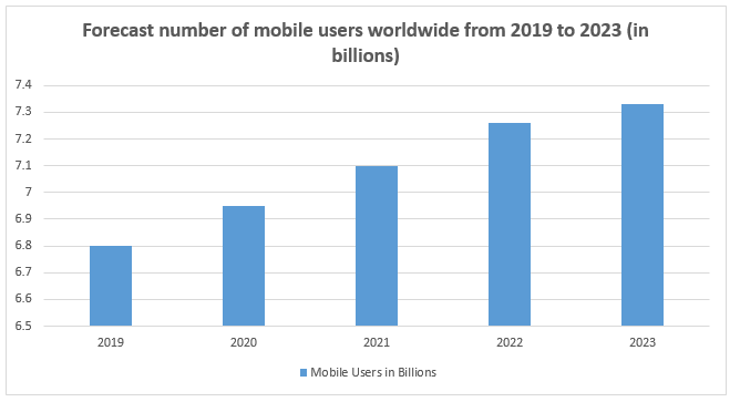
Mobile users are highly goal-oriented. There are 6.8 billion mobile users in 2019 and are estimated to increase in the coming years.
Optimizing your mobile view is crucial for grabbing your visitors’ attention. 58% of global traffic comes from mobile platforms, but accounts for only 16% of total sales. Mobile versions of most online stores are not fully optimized, which frustrates users and negatively impacts conversion rates. In this article, we’ll discuss the practices you need to implement to optimize your website for a state-of-the-art, mobile-friendly user experience.
1) Test your site’s performance
Design your website in such a way that it loads even with a weak internet connection. Some of your visitors might not have access to 4G or even 3G making it difficult to load pages with rich content. If a mobile site takes more than 3 seconds to load, 53% of visitors will abandon it.
To help make your website load faster, Google has introduced their Mobile-Friendly Test, which shows all the errors and limitations that GoogleBot encounters while crawling your website. You can also use their usability report for additional help.
Google also offers a tool called Test My Site. While the previous tool deals with the technical side of your site, this tool tests your page loading speed, optimizations, and on-site content.
2) Design simple navigation
Mobile devices have smaller screens than traditional computers, which makes site navigation more difficult.
- Design a touch-friendly interface
- Only add top-priority content
- Use specific, concise options
87% of your shoppers start by searching for products on their phone, and 67% of them will leave if unable to navigate after 3-5 seconds. Websites often crowd their mobile view, unaware that doing so distracts their visitors. It’s better to keep navigation minimalistic.
Customers may forget the product they bought, but they will always remember the experience you provided them.
3) Make your buying process easy
Mobile users are goal-oriented and want a quick and simple buying process. Mobile sites’ average cart abandon rate is 89% compared to 80% for desktop browsers. To cater to your users’ needs, you should reduce the number of clicks required so shoppers can reach your checkout page faster.
- Showcase the price tag of the product
- Streamline the payment process with express payment options
- Offer a guest checkout option
In order to increase your mobile conversion rate, you need to eliminate obstacles and distractions, reduce clicks, and optimize the checkout page. Auto-populate as many fields as possible during checkout.
4) Make search feature-rich
Since smartphones have smaller screens, you should offer autocomplete features relevant to your users’ search queries. If your autocomplete doesn’t provide relevant products or services, remove it because it will distract your users by giving irrelevant information.
- Design the search bar to be visible and quickly recognizable
- Make the search bar hover over the top
Also include product attributes such as color, specifications, and size in the search options to offer more accurate results. It’s better to avoid icon-only search buttons because they require an additional action from your user. Mobile sites employing search effectively have shown a 2.6x increase in their converted customers.
5) Optimize your product detail page
Show your products to be as relatable as possible.
- Show pictures first
- Support mobile gestures
- Highlight any value-adding service
Creating your responsive website involves more than just rearranging the content. You must create a unique user experience that can accommodate different types of devices. This can be a complex and effortful process, but in the long run it increases your traffic and user interaction while reducing your bounce rate and cost per lead.
Conclusion: Go mobile-first for the win
The design considerations in this article have been distilled from thousands of successful mobile sites. They have been proven to improve conversion rates and customer satisfaction, which will help your organization race ahead of the competition in 2019.
For a more in-depth look at how to implement these changes on your website, please download our complete eBook here.